
A website can look modern, load crisp typography, and still fail to generate qualified business enquiries. When visitors arrive on a page, browse briefly, and leave without getting in touch, the breakdown is rarely solved by adding another visual flourish or moving a button around.
Website conversion is not a single trick. It is the result of a clear, deliberate path connecting visitor intent to a trustworthy business outcome. Every element on the page either builds clarity and confidence or creates friction that drives potential clients away.
This guide explains how to structure, write, and engineer a business website that reliably turns interested visitors into qualified customers, whether you are evaluating an existing website or planning a complete redesign.
What Does a High-Converting Website Actually Do?
A high-converting website does not try to persuade everyone. Its primary function is to guide the right visitors toward taking a specific, valuable action, such as booking a consultation, submitting a detailed project brief, or purchasing a service.
At the same time, an effective website filters out bad-fit traffic. If your website attracts unqualified enquiries that waste sales time, increasing raw submission numbers only magnifies fulfillment problems. True conversion optimization focuses on qualified outcomes.
To understand the leverage of conversion, consider a simplified illustration: if 100 qualified decision-makers visit your site each month, a 1% conversion rate produces 1 enquiry, while a 2% rate produces 2 enquiries. In that simple arithmetic example, the volume of opportunities doubles without spending extra money on advertising.
Real business growth, of course, also depends on deal size, sales close rates, client retention, and operational margins. But removing friction on your website ensures that your marketing investment produces the maximum possible commercial return.
“Conversion optimization is the ultimate force multiplier. Before you spend more money filling the funnel with traffic, fix the holes in the bucket.”
Sufyan Tariq, Founder of Mashhoori
Start With Visitor Intent, Not Visual Decoration
Before writing copy or choosing layout structures, you must understand where your visitors come from and what problem they are trying to solve. A useful way to think about visitors is to group them by how close they are to a decision:
- Problem-Aware Visitors: They recognize a business challenge (such as sluggish lead generation or an outdated brand presence), but they are still diagnosing root causes and exploring possible directions.
- Solution-Aware Visitors: They know they need a specific capability (such as custom web development or technical SEO), but they are comparing different approaches, scopes, and technical options.
- Closer to Choosing a Provider: They have defined requirements, an active timeline, and budget context. They are evaluating team experience, relevant project evidence, and commercial fit.
High conversion requires message matching. The promise made in your search listing, referral link, or advertisement must match the headline and primary message on your landing page immediately.
Why Generic Homepages Fail Specific Search Queries
A common conversion leak occurs when businesses direct specific commercial searches to a generic homepage. For specific commercial searches, a dedicated service page can reduce the amount of interpretation required from the visitor because the headline, proof and next step can focus on one need.
When an unfamiliar visitor lands on a broad overview instead, they have to work harder to determine whether the business handles their specific requirement. Most visitors will not search a complex navigation menu for answers; they will return to the search results.
Craft an Obvious, Instant Value Proposition
When a new visitor lands on your website, they make an immediate assessment about whether to stay. In those opening moments, your hero section should clearly answer four fundamental questions without requiring extensive scrolling:
- 1. What do you offer? Describe your core service in concrete, unambiguous language rather than vague slogans.
- 2. Who is it for? Identify your target industry, company size, or specific customer profile.
- 3. Why should they choose you? Highlight a tangible differentiator, such as engineering standards, specialized expertise, or dedicated support.
- 4. What should they do next? Provide a prominent, clear primary call to action.
A practical exercise is the 5-Second Clarity Check: show your hero section to someone unfamiliar with your business for five seconds, then hide the screen. If they cannot clearly state what you offer, who it is for, and how to get started, your value proposition can likely be simplified.
The 5-Second Hero Section Clarity Audit
Test your website with an objective peer: within five seconds of viewing, can they identify your primary service, target client profile, and main call to action? If they have to guess, replace abstract marketing slogans with direct, outcome-focused language.
Structuring the Hero Section Above the Fold
An effective hero layout pairs a clear, high-contrast headline with a supporting sub-headline that expands on the primary benefit. Place your primary action button directly beneath the sub-headline.
Where genuinely available, support the hero or nearby sections with relevant proof such as real customer logos used with permission, specific credentials, or a concise indication of experience. Auto-rotating carousels and heavy background media can add distraction and performance cost when they are not carefully implemented.
Engineer a Frictionless Page Hierarchy
One practical sequence for a service page is to organize sections around the natural questions a buyer asks while evaluating a provider:
- 1. The Hook (Hero): State the core value proposition and primary action above the fold.
- 2. The Problem Context: Describe the specific operational pains, missed opportunities, or technical hurdles your customer is facing.
- 3. The Solution & Mechanism: Explain clearly how your service solves the problem, outlining your approach and key deliverables.
- 4. Verifiable Proof: Present the strongest proof you can genuinely substantiate, such as documented project examples, attributable reviews, verified credentials, or transparent process evidence.
- 5. Clear Process: Break down how working with you begins in 3 to 4 simple, transparent steps.
- 6. Direct Call to Action: Provide a focused contact form or scheduling module to capture the qualified lead.
This sequence is a useful model rather than a rigid rule. Different commercial models and shorter landing pages may combine or reorder these sections based on how much information a visitor needs before taking action.
Structuring a Service Page Around Visitor Decisions
Readers scan online text using layer-cake and F-shaped visual patterns, skimming subheadings and bullet points before committing to full paragraphs. Use descriptive headings that communicate key benefits on their own.
Maintain generous white space and clean typography. When text blocks are short and visual rhythm is consistent, prospective clients can evaluate your capabilities comfortably without cognitive fatigue.
Position Calls to Action Deliberately
Every key page should have one unambiguous primary call to action (CTA). Several equally prominent actions can make the intended next step less clear.
Make your primary CTA button visually dominant with solid contrast against your page background. If you offer a secondary action for earlier-stage prospects (such as reviewing case studies or reading a guide), style it as an outline button or text link to maintain clear visual hierarchy.
Use active, outcome-oriented button copy. Instead of passive words like "Submit" or "Click Here," use phrases that describe the value or step received, such as "Schedule a Discovery Call," "Request Project Scope," or "Get in Touch."
Repeat the primary action where it naturally follows a meaningful decision point, such as after a detailed service breakdown or following verifiable proof. A sticky mobile action can be useful when it remains unobtrusive and appropriate to the page.
Build Trust Before Asking for Commitment
Trust is the foundation of high-ticket B2B and professional service sales. Asking a visitor for sensitive contact details or a substantial commercial commitment before establishing credibility can increase hesitation or abandonment.
Incorporate genuine proof elements appropriate to your business throughout your page layout:
- Documented Project Examples: Share specific challenges, technical solutions, and measurable business outcomes achieved for real clients.
- Attributable Client Reviews: Include client names, job titles, and company names rather than anonymous quotes.
- Team & Leadership Transparency: Display real team photos, founder profiles, and physical company locations to demonstrate an established, accountable business.
- Transparent Process & FAQs: Address common questions regarding project timelines, working methods, and communication upfront.
Position helpful micro-copy near conversion triggers to set expectations. Useful examples include explaining what happens after form submission, outlining expected response timelines where known, providing privacy context, or clarifying why specific project details are requested.
Design Mobile-First for Real-World Use
Start with your own analytics. Compare device categories and identify whether mobile visitors experience different engagement or conversion patterns.
Mobile conversion optimization requires careful attention to ergonomic touch targets and thumb interaction zones.
The W3C WCAG 2.2 accessibility standard sets a 24 by 24 CSS pixel Level AA minimum for pointer inputs, subject to documented exceptions such as inline text links. For primary mobile conversion buttons, sizing touch targets to 44 by 44 CSS pixels provides a more forgiving and reliable tap area.
Ensure mobile navigation is streamlined and easy to close. Avoid intrusive full-screen overlays that are difficult to dismiss on small screens, and configure form inputs with appropriate keyboard triggers (such as email and telephone keyboards) to minimize mobile typing friction.
Treat Website Performance as Part of the Conversion Experience
Technical performance shapes the experience visitors have while trying to understand and act on your offer. Delayed content, sluggish interaction and unexpected layout movement can add friction before a visitor ever reaches your message.
Google assesses real-world user experience against good Core Web Vitals thresholds, evaluated at the 75th percentile of real-user page loads:
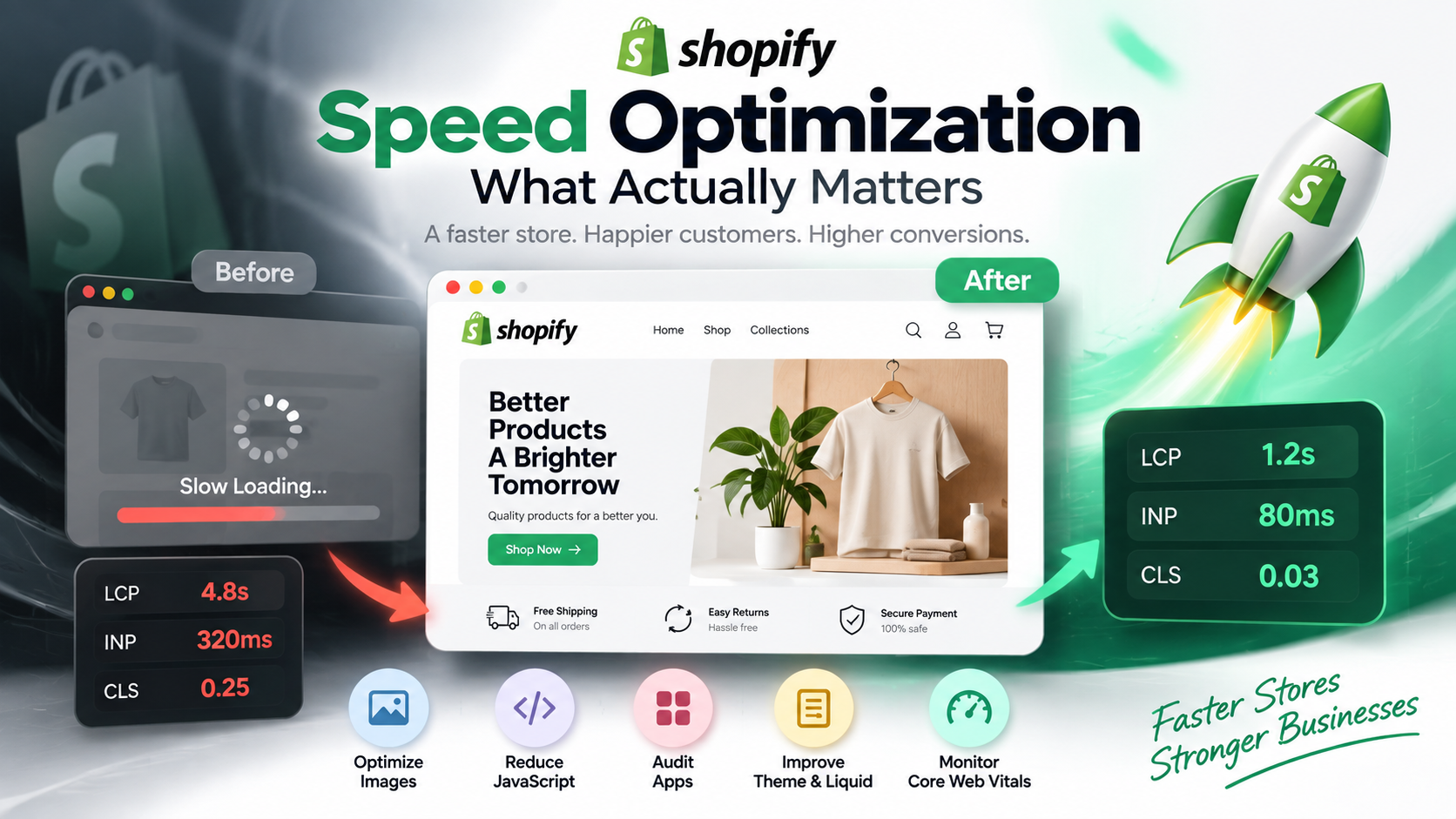
- Largest Contentful Paint (LCP): Measures loading speed; a good LCP is 2.5 seconds or less for the main content block.
- Interaction to Next Paint (INP): INP measures interaction responsiveness across a page's user interactions; a good INP is 200 milliseconds or less.
- Cumulative Layout Shift (CLS): Measures visual stability; a good CLS score is 0.1 or less, avoiding unexpected layout jumps during page load.
Practical performance optimization includes right-sizing and compressing images (WebP/AVIF), optimizing font delivery and avoiding unnecessary font weights or files, reducing unnecessary third-party tracking scripts, configuring server-side caching, and using an appropriate CDN where useful.
Technology stack choices should reflect your operational requirements. When choosing between WordPress and custom development, remember that implementation quality is the decisive factor. A cleanly built WordPress site on high-performance hosting can be fast and reliable, while an unoptimized custom web app burdened with excessive client-side JavaScript can easily frustrate users.
Reduce Friction in Navigation and Forms
Extra navigation choices can make the main path harder to identify. Your primary navigation header should focus on essential buyer decision paths: understanding core capabilities, reviewing past work, understanding your process, and initiating contact.
On lead generation forms, ask only for information genuinely needed to move the conversation forward. A simple enquiry may need very little information, while a complex project may justify additional qualification.
Provide clear, permanent field labels above input boxes rather than relying on placeholder text that disappears once typing starts. Ensure inline validation provides immediate, constructive feedback if a field is formatted incorrectly.
For more complex enquiries, progressive disclosure or a carefully designed multi-step flow can reduce visible complexity, but it should be tested against the business's qualification needs.
Measure the Right Signals and Improve Continuously
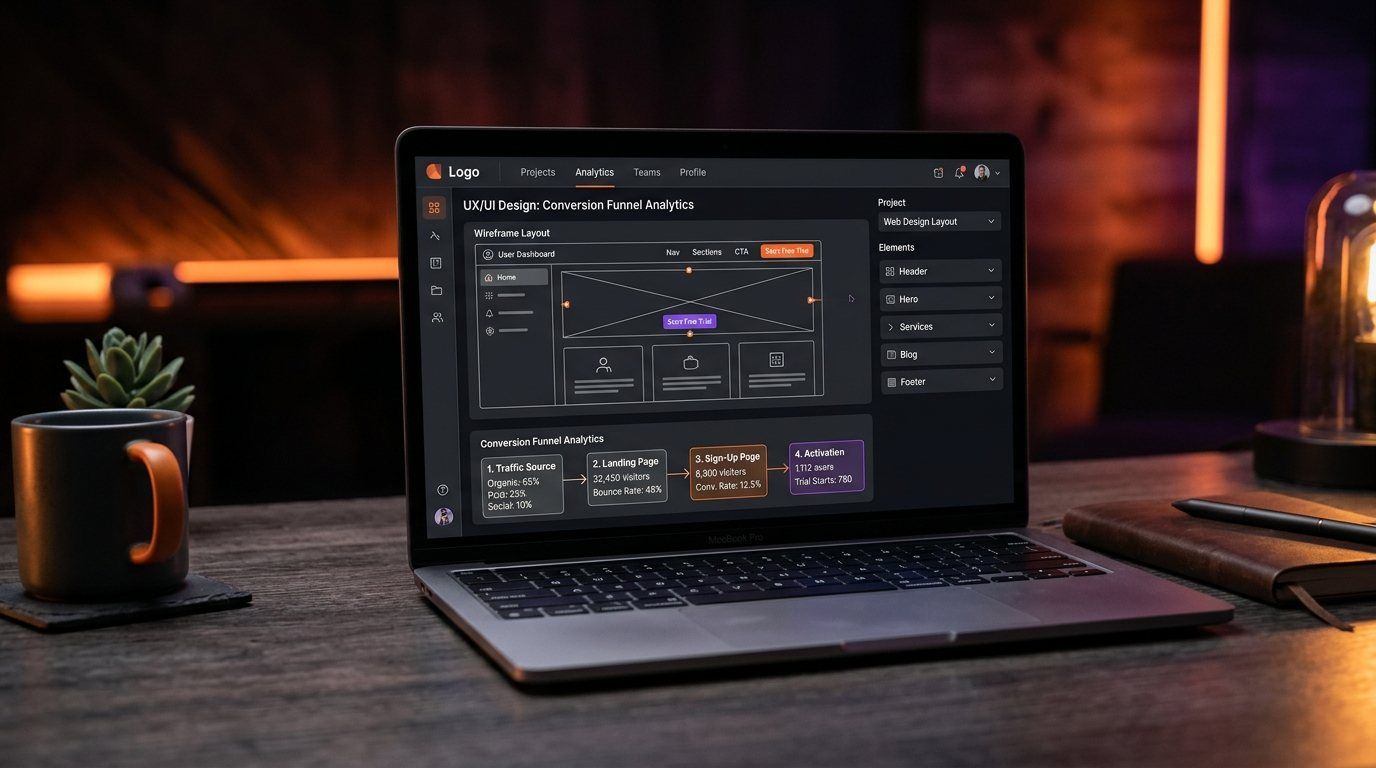
Publishing a website is not the end of the optimization process; it is the point where real empirical measurement begins. To make informed improvements, structure your measurement across three distinct layers:
- Primary Business Outcomes (Key Events): Direct commercial conversions, such as qualified contact submissions, scheduled discovery calls, or direct phone inquiries.
- Supporting Engagement Events: Milestone actions that indicate meaningful interest, such as CTA button interactions, form starts, case-study interactions, or service-page engagement defined by the measurement plan.
- Diagnostic Signals: Contextual behavioral indicators, such as session engagement rates, form field drop-offs, and device-specific exit patterns.
In Google Analytics 4, mark business-important actions as Key Events so they can be included in reporting and attribution analysis.
A solid conversion path works best when supported by sound technical architecture. Implementing technical SEO foundations for a business website ensures that search engines can discover, crawl, and index your landing pages accurately.
According to Google Search Central guidance on page experience, creating helpful, relevant content remains primary for search performance, while a fast, high-quality user experience supports visitor satisfaction and business results.
Is It a Traffic Problem or a Website Problem?
When a business struggles with low online lead volume, leadership often assumes the website needs a complete redesign. In many cases, however, the real bottleneck is traffic quality, commercial positioning, or inaccurate measurement.
Before committing to an overhaul, use this 8-point diagnostic framework to identify the root cause:
- 1. Traffic Relevance: Are your visitors arriving from keywords, ads, and referral sources that match your core commercial capabilities?
- 2. Search Intent Alignment: Does the visitor intend to engage a service provider, or are they looking for basic educational information and free templates?
- 3. Message Match: Does your landing page headline immediately confirm the specific topic or service that prompted the user to click?
- 4. Measurement Accuracy: Are form submissions, phone inquiries, and direct messages tracking reliably in your analytics setup?
- 5. Drop-Off Diagnostics: Compare engagement, exits, form progression and performance data by landing page, device and traffic source. Look for repeated patterns before assigning a cause.
- 6. Offer & Value Proposition Clarity: Can an unfamiliar visitor understand the offer, who it serves, its main value and the next step?
- 7. Trust & Credibility Signals: Does the page provide credible proof appropriate to this business, such as attributable reviews, documented work, verified credentials, clear company information, or a transparent process?
- 8. Sample Size & Sales Cycle: Has the page received enough qualified visits over a realistic evaluation period relative to your industry buying cycle to draw reliable conclusions?
Do You Need a Redesign or Just Better Optimization?
Deciding between incremental website optimization and a full website rebuild should be based on architectural reality rather than aesthetic preference.
Targeted Optimization is Usually Sufficient When:
- The core CMS and codebase are modern, maintainable, and secure.
- The overall site structure and navigation hierarchy remain sound.
- Conversion friction is isolated to specific sections (such as unclear headline copy, missing proof, or an unnecessarily long contact form).
- Performance issues can be remediated with asset optimization, caching, or script cleanups without rebuilding templates.
A Complete Website Redesign / Rebuild is Justified When:
- The existing platform or theme is rigid and prevents adding modern layouts, structured content models, or custom conversion funnels.
- The mobile structure is fundamentally broken and cannot be remediated without rewriting extensive CSS.
- Technical debt or bloated legacy templates create systemic performance problems that are disproportionately difficult to remediate within the current architecture.
- Your core service offerings, company positioning, or target market have evolved significantly beyond what the legacy site can support.
Conversion-Focused Website Checklist
Use this 10-point checklist to audit your website pages against fundamental conversion principles:
- [ ] Visitor Intent: Landing page headlines directly match the search queries or ads driving traffic.
- [ ] Value Proposition: The hero section passes a simple clarity check: an unfamiliar reader can quickly understand what you offer, who it is for, and what to do next.
- [ ] Clear Visual Hierarchy: Pages follow a logical narrative flow (Hook, Problem, Solution, Proof, Process, Action).
- [ ] Unambiguous CTAs: The primary call to action is distinct and repeated at natural decision points.
- [ ] Credible Proof: Genuinely substantiated proof, client reviews, or credentials appear before asking for commitment.
- [ ] Mobile Usability: Interactive targets account for WCAG 2.2 sizing and spacing guidance; important mobile actions use comfortable touch areas.
- [ ] Fast Performance: Page performance is assessed against good Core Web Vitals thresholds (LCP under 2.5s, INP under 200ms, CLS under 0.1).
- [ ] Focused Navigation: Header menus prioritize essential buyer decision paths without unnecessary clutter.
- [ ] Low-Friction Forms: Forms ask only for information necessary for the current conversation stage, with clear permanent labels.
- [ ] Accurate Tracking: Primary business outcomes and useful supporting events are configured in Google Analytics 4.
Build Around the Decision You Want Visitors to Make
A high-converting website is not built by chance. It is engineered with clear intent, fast technical foundations, compelling value propositions, and continuous measurement. When you remove friction and respect your visitor's time, your website transforms from a passive online brochure into an active business growth asset.
If your current website makes it difficult for prospects to understand your offer, trust the business or take the next step, a redesign may be worth discussing.
Mashhoori builds business websites around clear user journeys, maintainable development and practical performance. You can explore our Website Development capability or contact us to discuss what your current site needs.
Need a Website That Turns Visitors Into Customers?
Mashhoori combines modern web development, conversion-focused design and digital strategy to help businesses build stronger online experiences.